Peoplet Web Application
Built the frontend and design system for a complex network-analysis platform used by enterprise clients.
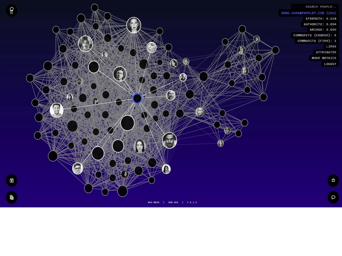
Peoplet's core product — visualizing complex relationship networks — was technically impressive but difficult to navigate. Users were getting lost in dense graph views with no clear entry point. The existing UI was built quickly for demos, not for sustained daily use, and the absence of a design system meant every new feature looked slightly different from the last.
1 year (ongoing engagement)
Product lead, 2 backend engineers, 1 data scientist
- Led UX design for the main application — graph exploration, search, and insight panels
- Built a shared Figma component library aligned to the application's data model
- Developed key frontend components in Next.js and TypeScript
- Worked directly with the Python/Django backend team to define API contracts
- Conducted usability reviews with 3 enterprise client teams to validate navigation changes
- Established a visual design language that held up across dense data views
Audit & Align
Ran a full UX audit of the existing application and interviewed 4 power users. Documented the 8 most common tasks and mapped how the current UI supported — or blocked — each one.
Design System
Built a Figma component library from scratch: tokens for spacing, color, and typography; components for the graph toolbar, data panels, and filter system. This gave the engineering team clear specs and eliminated inconsistency.
Iterative Development
Shipped improvements in two-week cycles. Each cycle started with a defined user problem and ended with a testable release. Graph navigation, search relevance display, and the AI insights panel all shipped this way.


Average session length increased by 2.4× after the navigation redesign, and enterprise clients reported 60% fewer support requests related to finding features.
“Robertino understood the complexity of our data model and translated it into an interface that even non-technical clients can navigate confidently. He works fast, asks the right questions, and delivers designs that actually hold up when you build them.”
Working on a complex data product or dashboard?
Let's build something worth showing.