Peoplet Website
Designed and built a fast, conversion-focused website that positions Peoplet for enterprise sales.
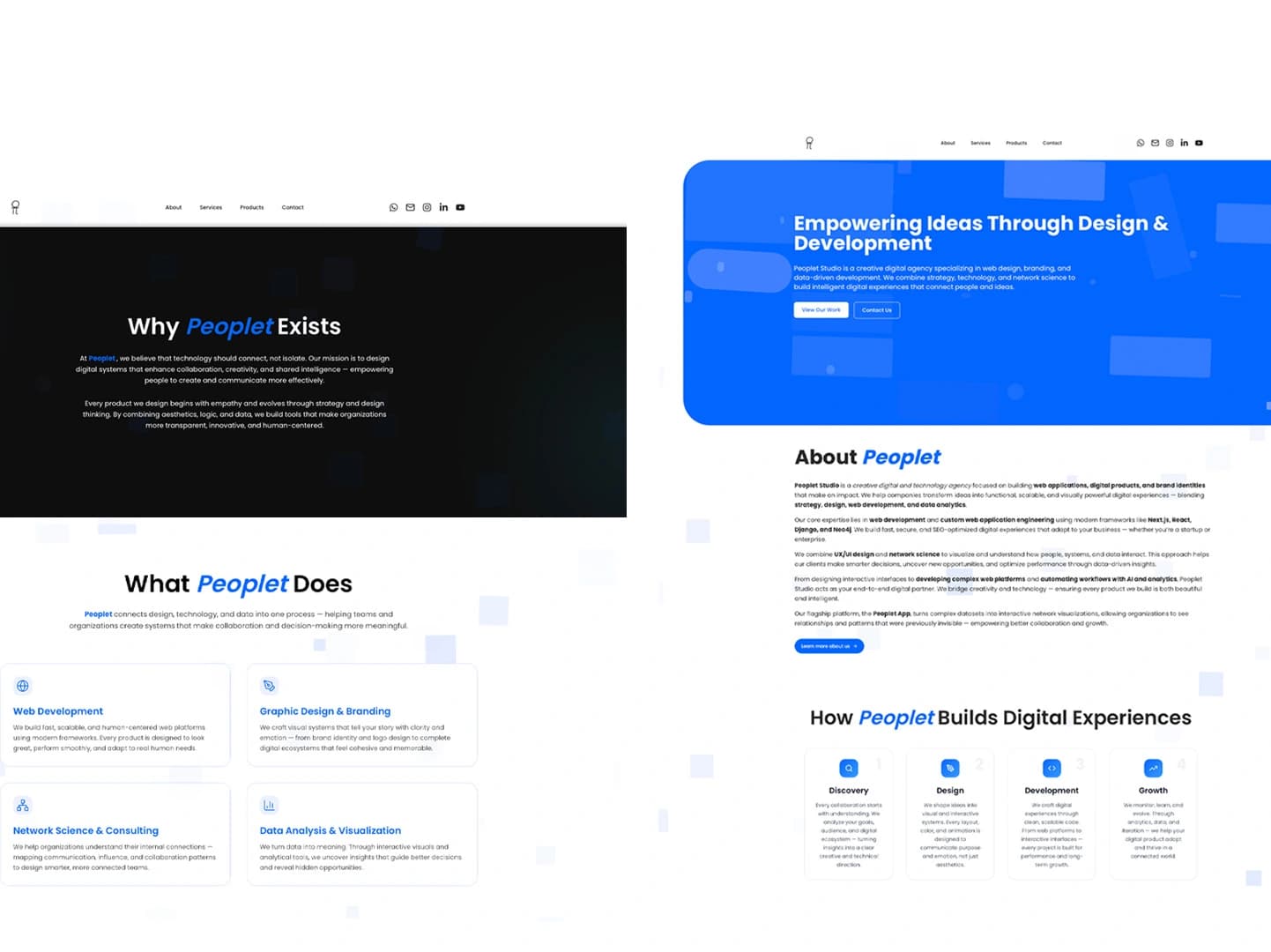
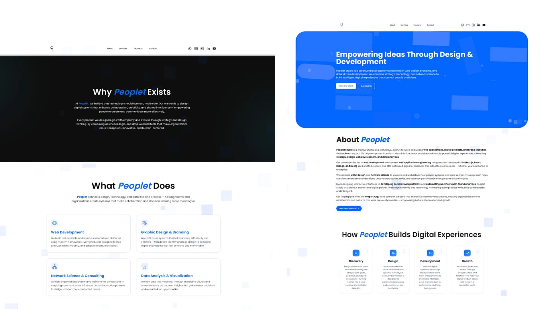
Peoplet's previous marketing site was built in a week for a launch deadline and it showed — mismatched typography, no clear messaging hierarchy, and a features page that listed capabilities without explaining value. Enterprise buyers evaluating the product couldn't quickly understand what Peoplet did differently from competitors.
2 weeks
Founder (copy review), no handoff gap
- Defined the information architecture and page hierarchy for the full site
- Designed all pages in Figma with a clear visual system and messaging hierarchy
- Built the site in Next.js with Tailwind CSS — optimized for performance and SEO
- Wrote component-level animations to guide attention without slowing load time
- Implemented Open Graph metadata and structured data for search visibility
Messaging & Structure
Worked with the founder to extract the three core value propositions and organize them into a content hierarchy. The homepage needed to answer 'what does this do and why should I care?' in under 10 seconds.
Design
Built the Figma designs with a clean two-tone palette, sharp typographic hierarchy, and deliberate use of whitespace to make the dense product screenshots feel approachable rather than overwhelming.
Build & Optimize
Developed in Next.js with static generation for all marketing pages. Images are served as WebP with lazy loading. Achieved a Lighthouse score above 95 across all pages.

The redesigned site reduced bounce rate by 34% and the average time-on-site doubled, with inbound demo requests increasing within the first 30 days of launch.
Need a marketing site that converts visitors into leads?
Let's build something worth showing.