Personal Branding
Built a personal brand identity system that communicates professionalism across every touchpoint without looking like everyone else's.
As a designer-developer hybrid, the standard portfolio templates and off-the-shelf brand kits looked wrong. They either leaned too far into developer aesthetics (monochrome, terminal fonts) or too far into designer aesthetics (pastel, soft shapes). The brand needed to communicate both disciplines clearly and feel considered — not assembled from a template.
2 weeks
- Defined the brand positioning and visual language before opening any design tool
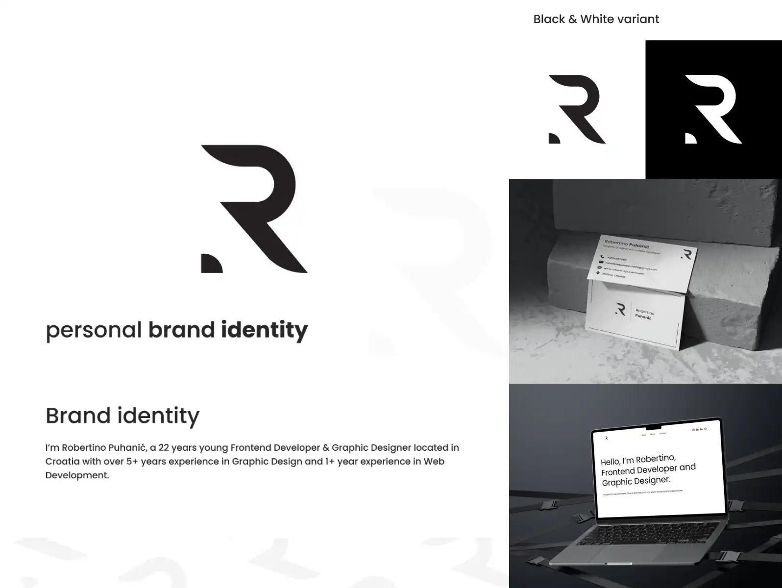
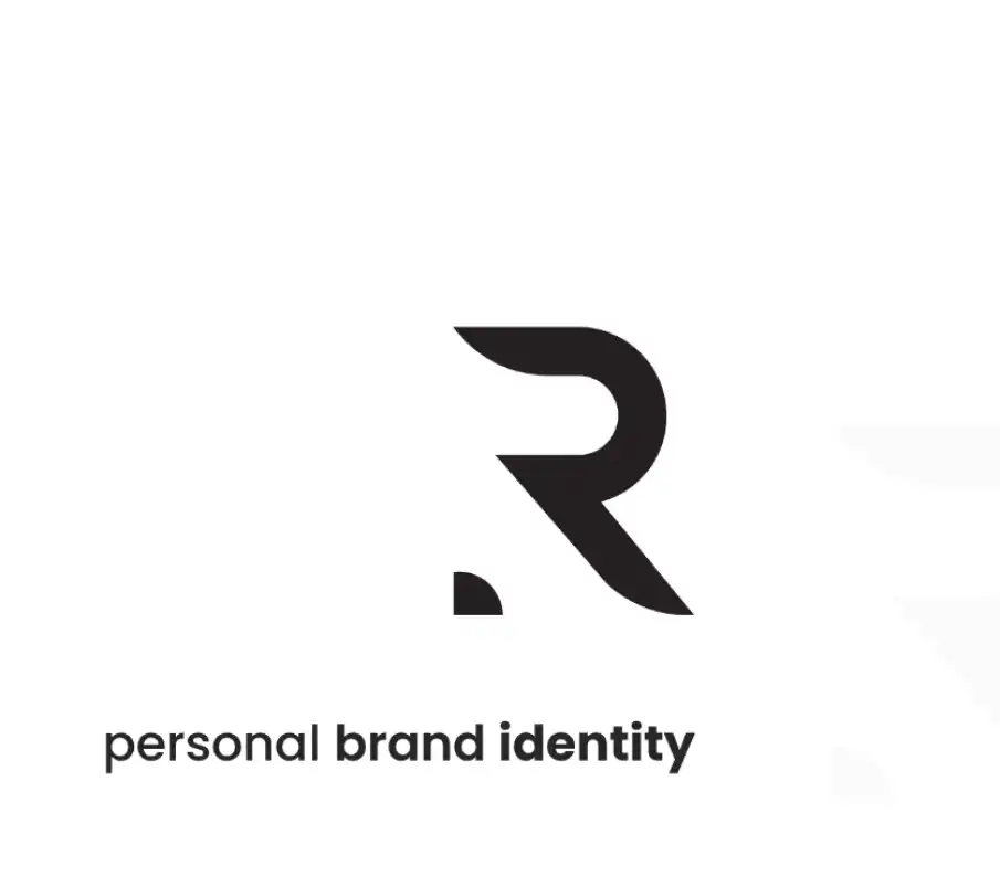
- Designed the primary logo mark, wordmark, and responsive logo variants in Adobe Illustrator
- Built the full color system — primary, secondary, neutrals, and dark/light usage rules
- Selected and paired typography with usage guidelines for headings, body, and UI contexts
- Created a mockup set covering business card, letterhead, digital assets, and social presence
- Documented everything in a brand guidelines PDF for consistent future use
Positioning
Started with language, not visuals. Wrote down 10 adjectives the brand should communicate and 10 it should not. This filter eliminated entire categories of visual approaches before touching Illustrator.
Identity Design
Explored 20+ logo directions, narrowed to 3 strong options, and pressure-tested each across use cases: small size, dark background, embroidery, one-color print. The final mark works at every scale.
System Completion
Expanded the approved mark into a full system: color, type, motion guidelines, and a mockup library. The deliverable was a complete brand kit, not just a logo file.

The brand identity was selected as a Behance Featured Project and has been consistently used across all professional touchpoints without modification since launch.
Need a brand identity that actually represents your work?
Let's build something worth showing.